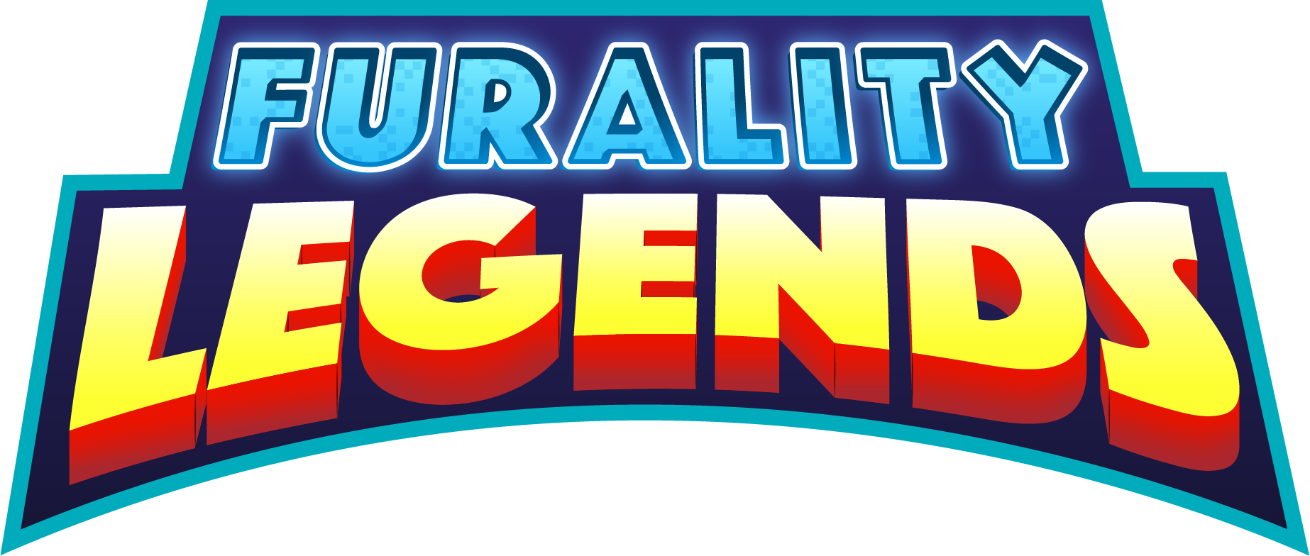
Furality Legends Logo
Furality Legends Logo - 2021
Furality, Inc. requested I work on a logo for their Fall 2021 virtual reality convention centered around superheroes.
I referenced many movie posters and comic book covers to come up with this design. The pop-out, arced word mark alludes to many of those properties, comic book reds and yellows to really push the hero thematic. Furality word mark is more recessed and calls to the digital nature of the non profit organization.
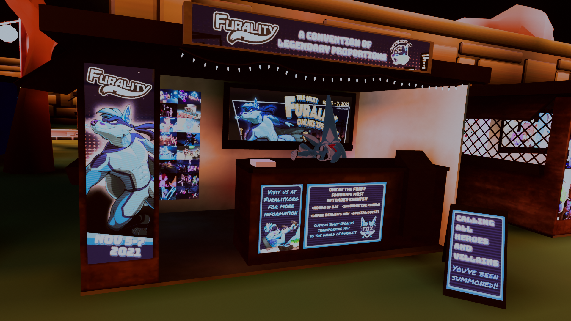
Furality Legends Booth at VRCon 2021
Furality Legends
Virtual Booth - 2021
Virtual Booth - 2021
Furality needed a promotional booth for VRCon and Eurofurence Online 2021 so I helped create this design for them.
As a virtual convention with a super hero themes, I went for digital signboard as inspiration. I used two typefaces that reflected the villain like graffiti and hero like bravado, along with textures and layouts to clearly communicate our theme and branding.
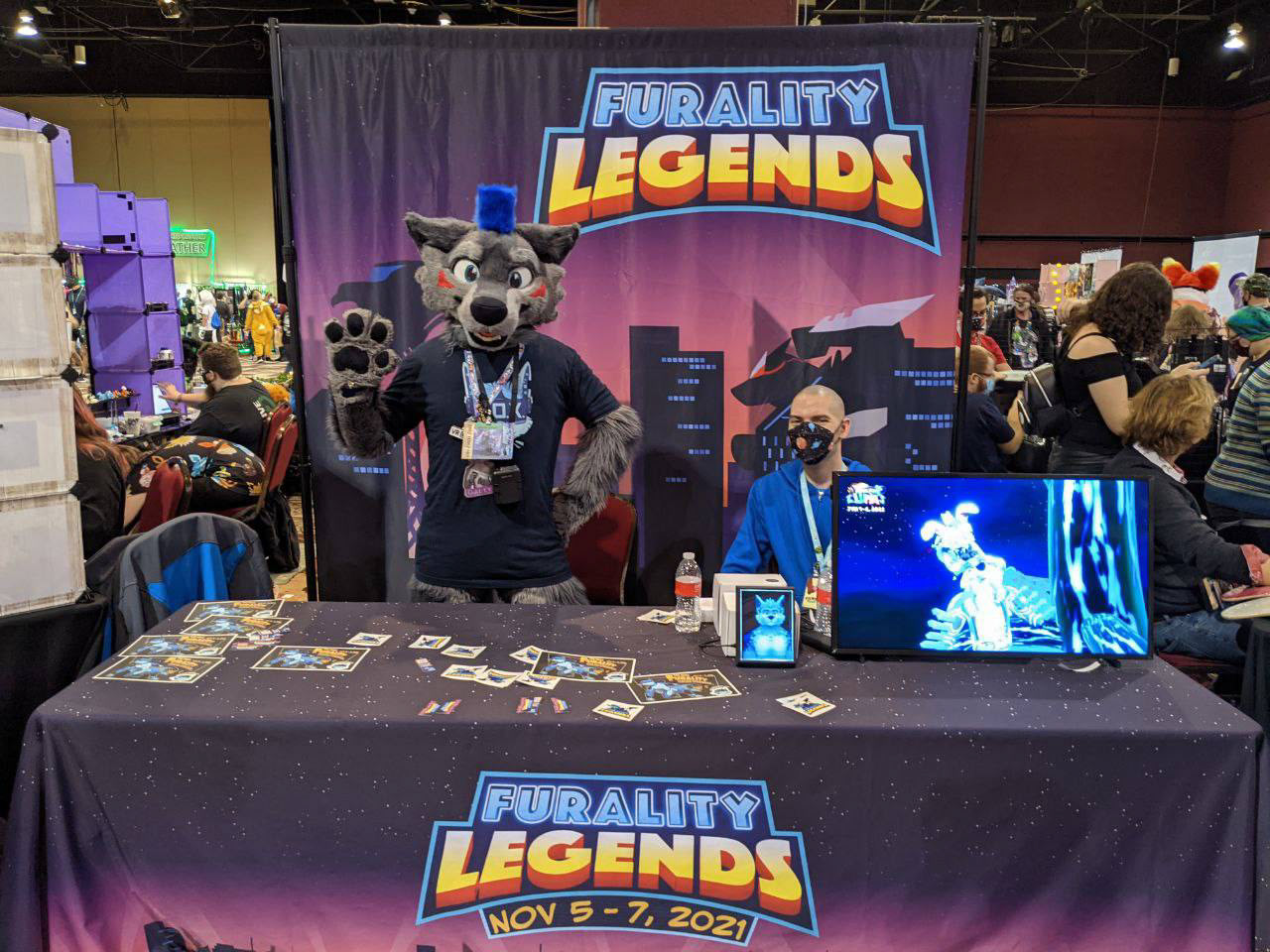
Furality Legends Physical Booth
Furality Legends
Physical Booth - 2021
Physical Booth - 2021
For Biggest Little Fur Con, Furality had a physical booth present so I helped vectorize and layout our current assets for the convention.
I helped turned rasterized assets into vector artworks so that they could be re-scaled to fit the required dimensions for the booth. The city pattern extends all around the bottom of the cloth in perfect quality, while the night sky expands everywhere else.
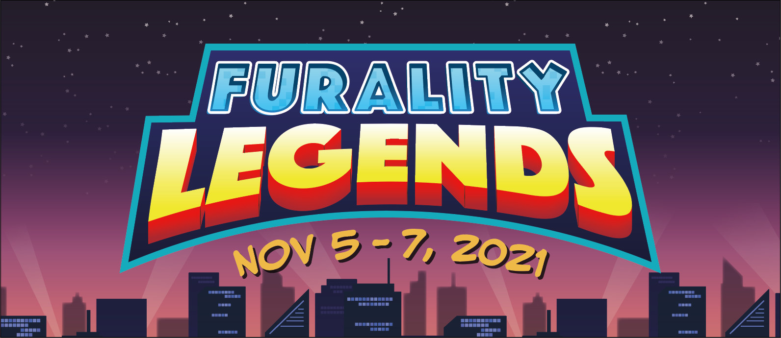
Furality Mini Card - Front
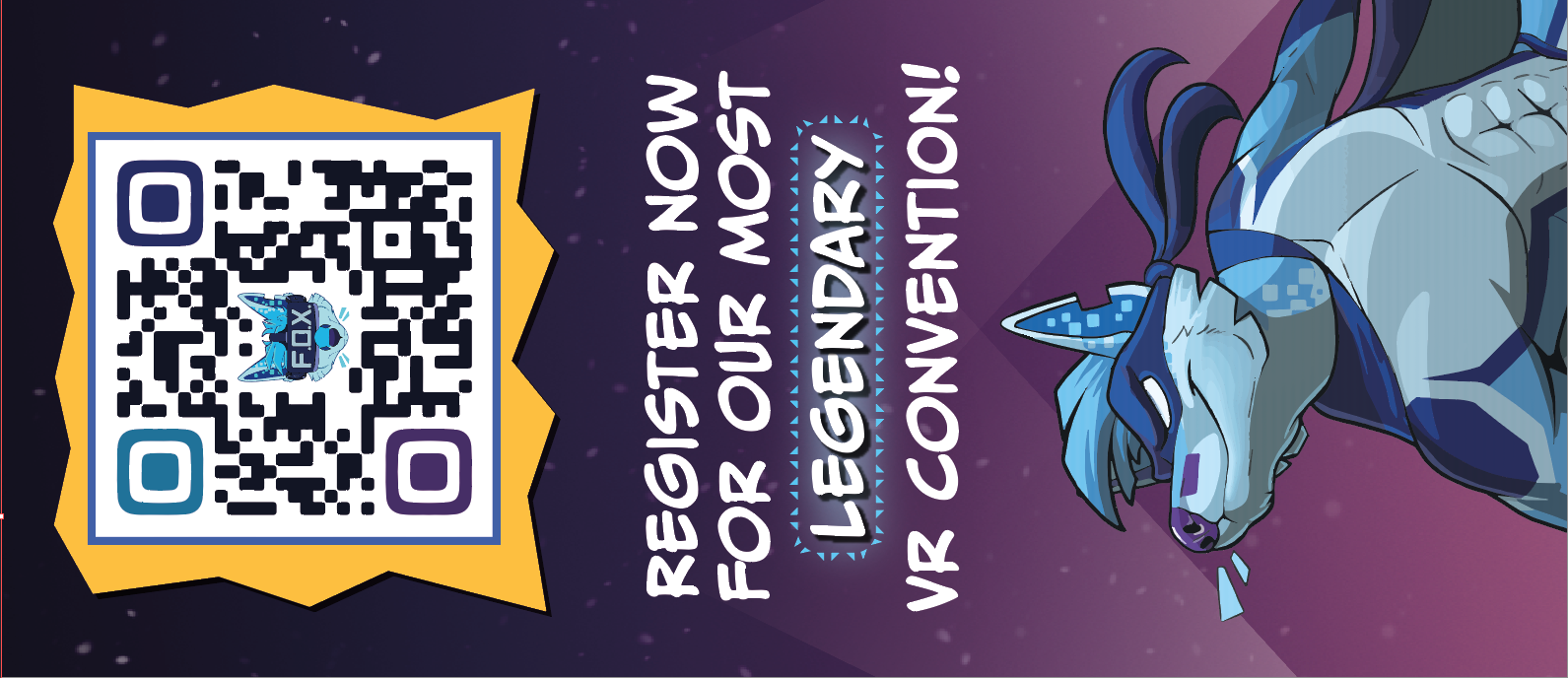
Furality Mini Card - Back
Furality Legends Mini Card - 2021
For Biggest Little Fur Con, Furality had a physical booth and needed a small business card to hand out for promotion.
I had sharp goals to clearly tell attendees when the date of the convention was and where to go to register. With that, I only had one call to action and some simple lay-outing to make the card simple and easily read.
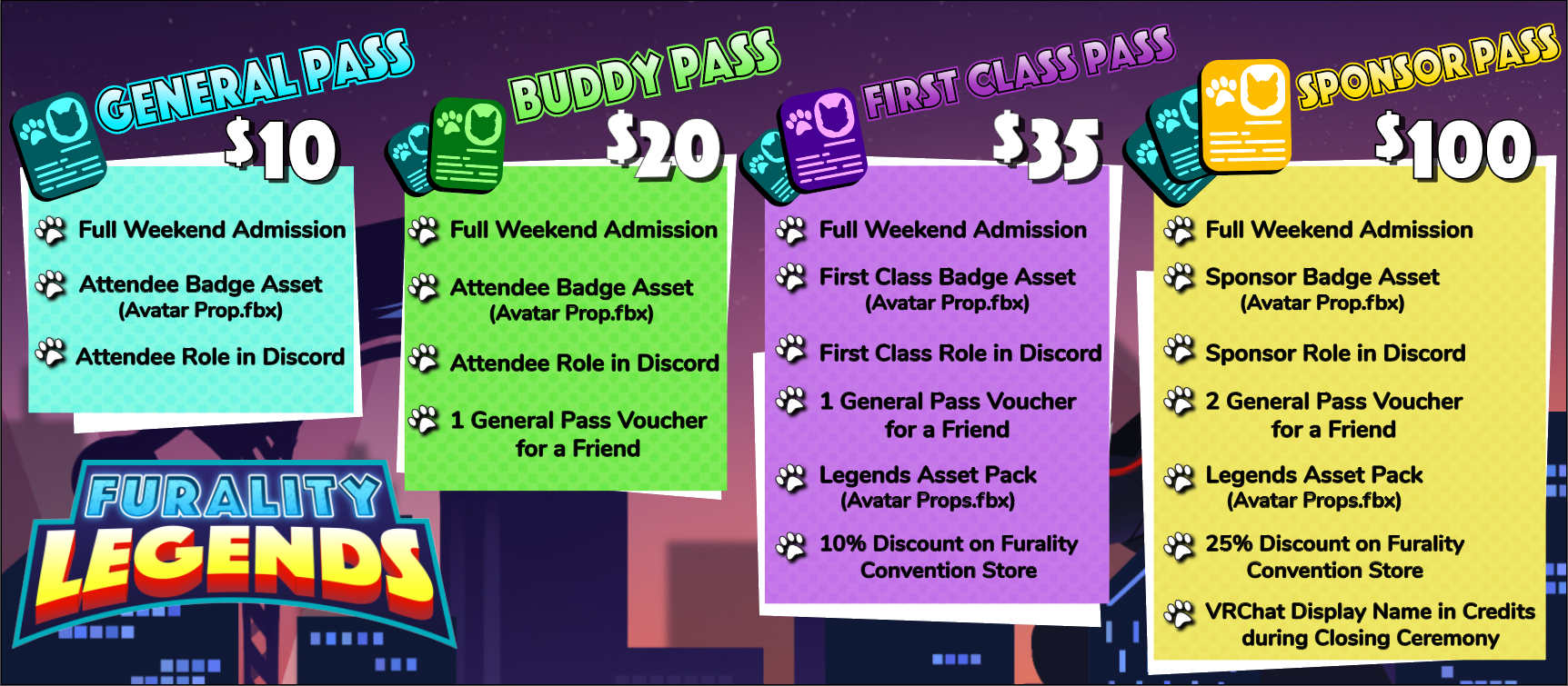
Furality Registration Sheet - Initial
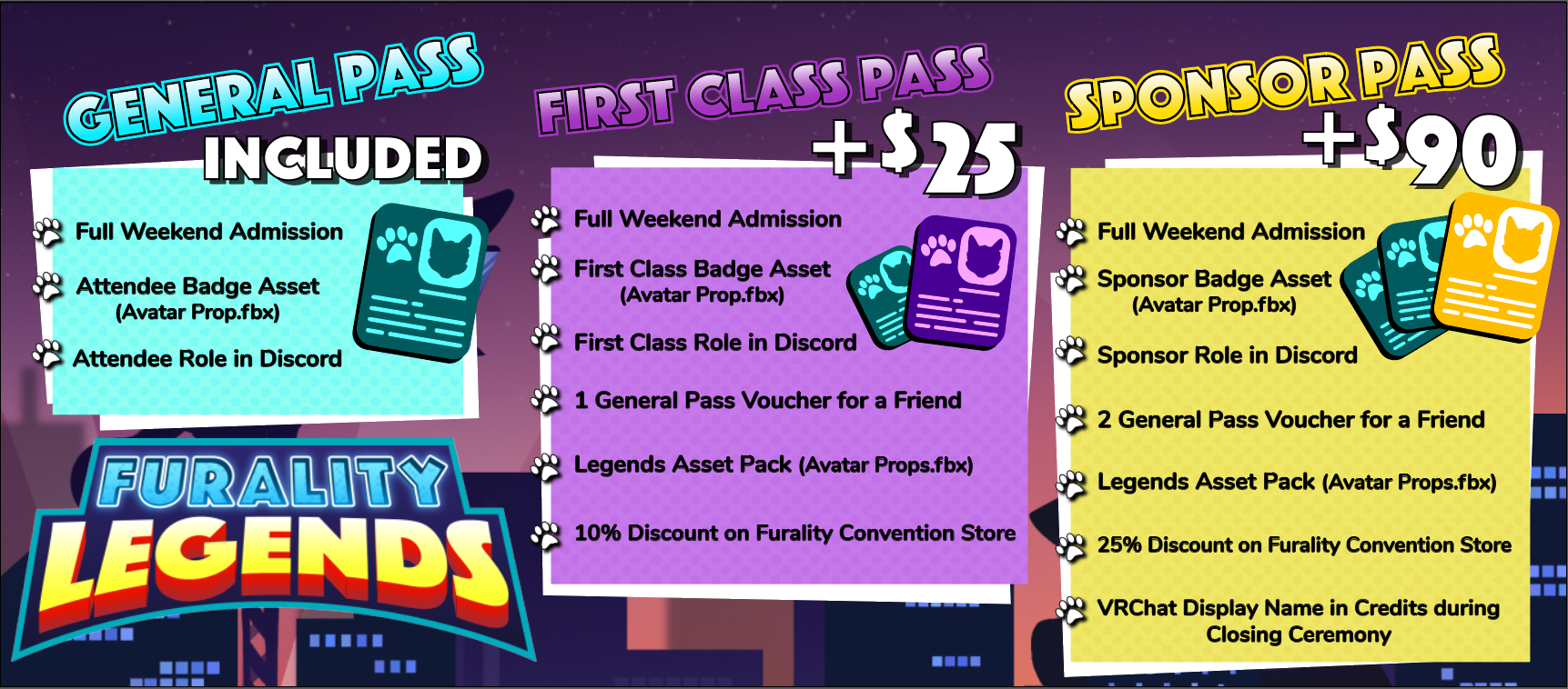
Furality Registration Sheet - Badge Upgrade
Furality Legends
Badge Registration Chart - 2021
For Biggest Little Fur Con, Furality had a physical booth and needed a small business card to hand out for promotion.
I had sharp goals to clearly tell attendees when the date of the convention was and where to go to register. With that, I only had one call to action and some simple lay-outing to make the card simple and easily read.

Happy Cow Ice Cream - Overhead
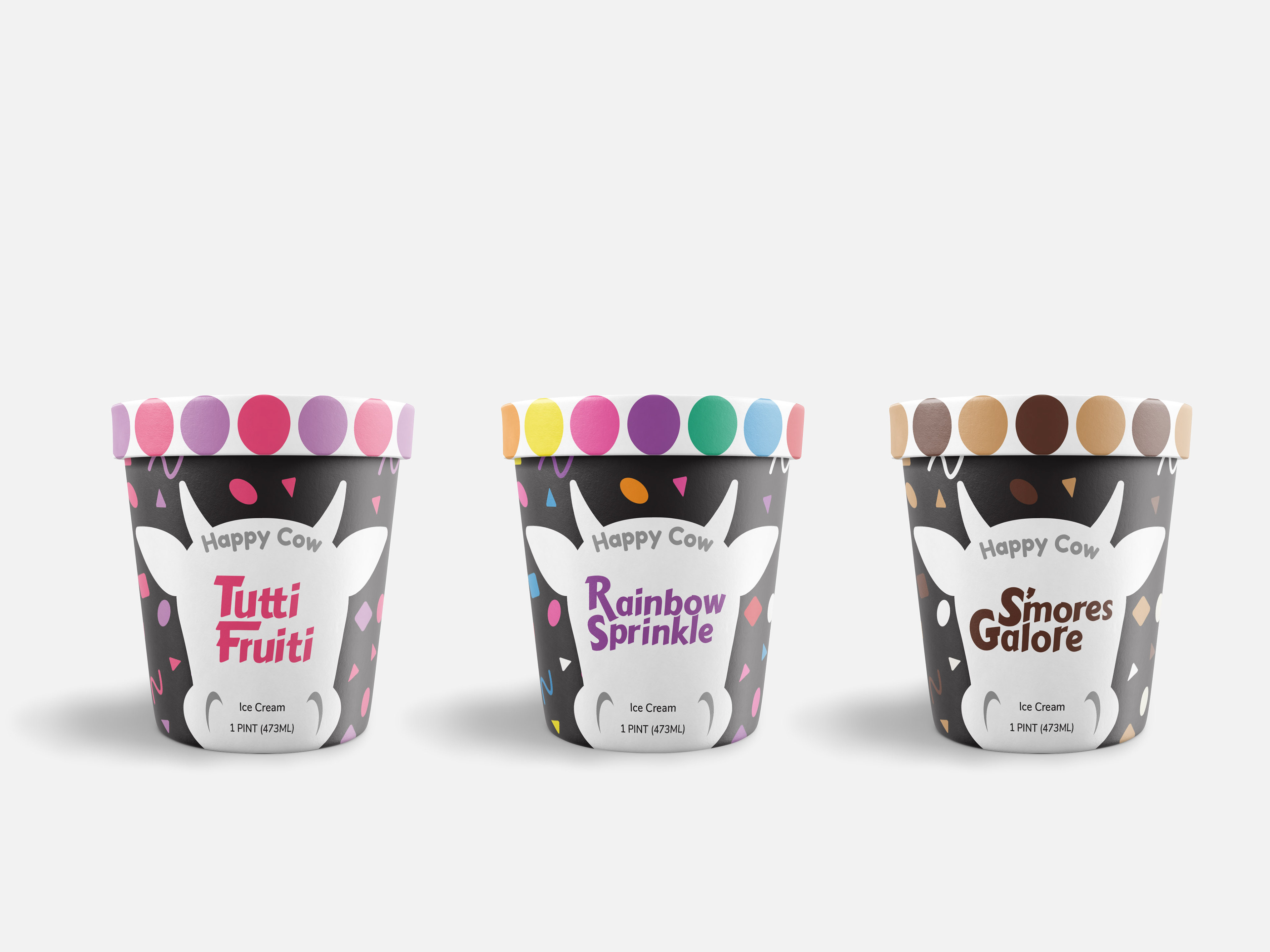
Happy Cow Ice Cream - Profile
Happy Cow Ice Cream - 2020
This project centered around creating 3 product packages under 1 brand, themed after a children's ice cream treat.
I used images of a cow and confetti to keep the brand cohesive, focusing the palettes and word mark to differentiate the flavors.

Malcolm Gladwell Trilogy Reimagination - Outliers
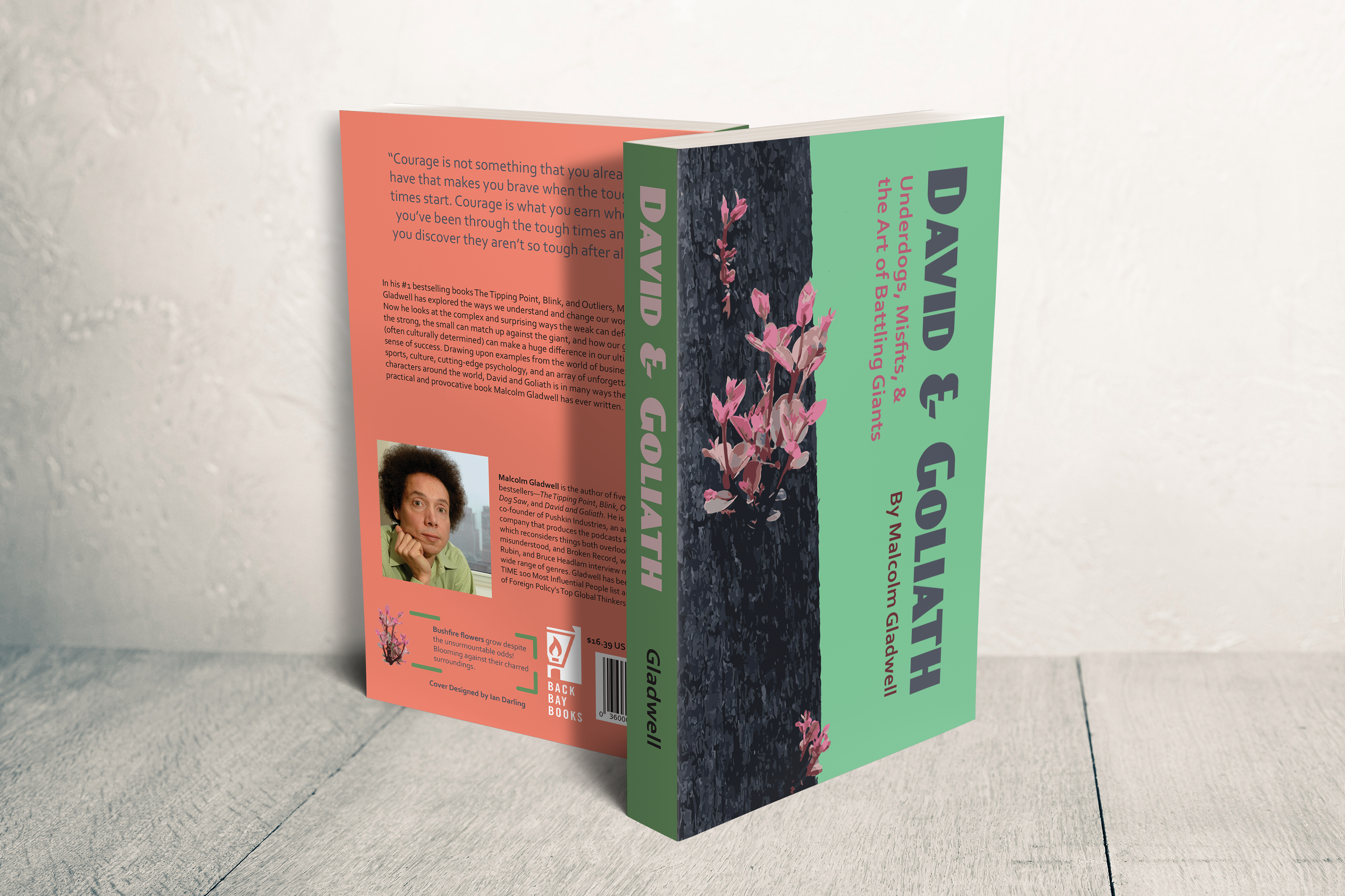
Malcolm Gladwell Trilogy Reimagination - David and Goliath
Malcolm Gladwell Trilogy Reimagination - 2020
A new visualization of Malcolm Gladwell's trilogy of books.
I went with a vertical slice style, to make the content more interesting to view as it centers around the spine of the book blooming different flowers that represent the internal struggles of the stories.
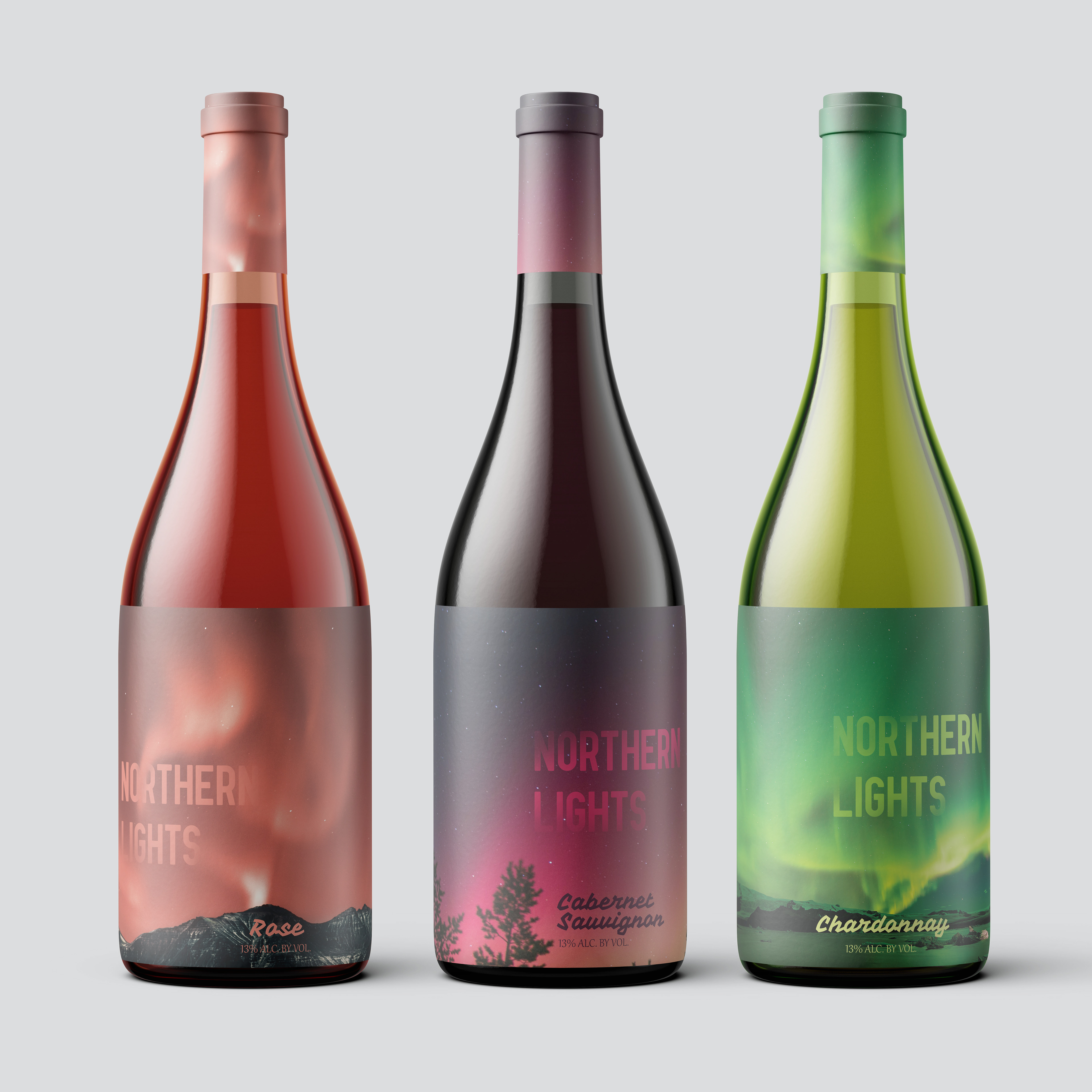
Northern Lights Wine - 2020
Series of wine bottles styled after the Aurora Borealis.
The designs call back to the palettes of the wine itself, making the labels easy to read and understand each flavor visually.
Punchinary - 2020
A fighting game glossary visualized in a grid system.
I used an easy to read palette to keep things readable without appearing too busy, with stick figures as representations of tactics used in fighting games.
